
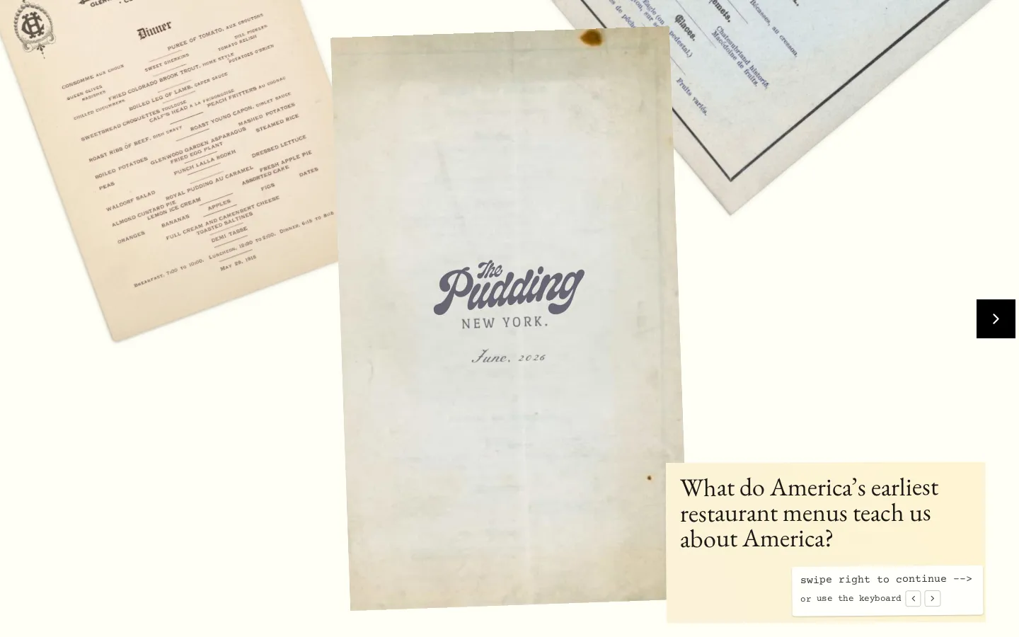
This Pudding visual essay treats restaurant menus as tiny paper witnesses. Across ten courses, Stephen Lurie and Matt Daniels use the New York Public Library's Buttolph Collection to trace how American dining, status, immigration, gender, and choice shifted from 1880 to 1920.
What is A History of Menus Is a Menu of History?
A menu tells you what dinner cost, but it also reveals who was expected to order, which cuisines carried prestige, and how a restaurant wanted to be understood. This essay builds its history from those small signals. Its source material comes from roughly 25,000 menus in the Buttolph Collection's 1880–1920 span; a related visualizer narrows that pool to 5,000 selected images so readers can compare designs and dishes without rummaging through an institutional catalog one item at a time. The story is arranged as ten courses, a neat device that keeps a large social history from turning into archival stew. Still, the menus reflect what survived and what one collector gathered, so they are evidence of a particular record, not a census of everything Americans ate.
What you can do there
- Advance through a ten-course story
- Inspect historical restaurant menus
- Compare dining customs across time
Why we picked it
It makes an everyday object do serious historical work without draining away its texture. The period typography, dish lists, prices, and house rules are not decoration around the argument; they are the argument, served one course at a time.
How to get the most from it
Follow the ten-course sequence before jumping to the companion 5,000-menu map. The guided essay supplies the historical frame; the map is better for wandering afterward, when a dish, city, year, or bit of menu design has given you a trail to chase.
Good to know
The page advertises swipe and keyboard navigation, but we did not render the experience, so exact controls, accessibility, motion, and mobile behavior remain unverified. Its 5,000-menu visualizer is a selected subset of a much larger period pool, and the companion map labels dish definitions as generated by AI rather than archival descriptions.
Who made it, and when?
Stephen Lurie and Matt Daniels is the credited creator or organization.
Creator’s official page Open A History of Menus Is a Menu of HistoryMore like this
Histography

A dense timeline where eras collapse into a field of small historical sparks.
Steve's Old Computer Museum

A wonderfully dusty filing cabinet of computers from before beige boxes learned to hide their weirdness.
Wayback Machine

A time machine for webpages, complete with a calendar and the occasional missing wire.
Bartosz Ciechanowski

Science essays with levers, sliders, and a knack for making machinery behave.