
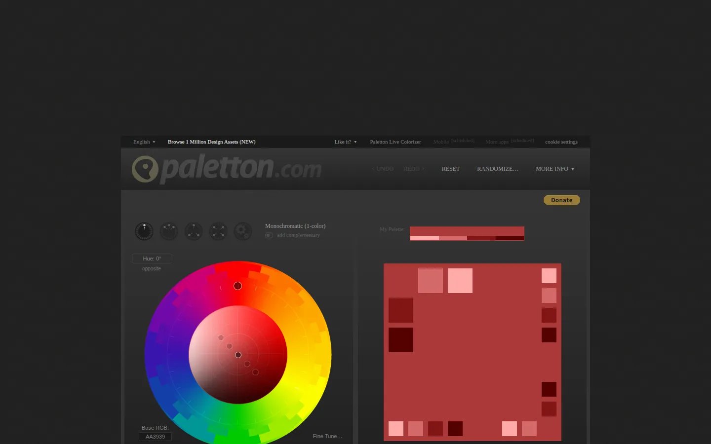
Paletton is a long-running color-scheme workbench built around a wheel, harmony models, and plenty of variations to inspect. It turns one chosen hue into a more deliberate starting point for a palette.
What is Paletton?
Paletton gives the color wheel a proper dashboard. Pick a starting hue, choose a relationship such as monochromatic, complementary, triad, or tetrad, and the tool produces a family of related swatches instead of a single lucky guess. Its own history places the current name and domain in 2014, after years as Color Scheme Designer, so the interface carries the feel of a durable specialist tool rather than a passing palette toy. The appeal is in the knobs: brightness, saturation, models, presets, and previews give you a way to move from a color instinct toward something you can examine. It is especially satisfying when a project already has one anchor color but the surrounding cast has not arrived yet. Bring the output back to the real design and test it there; a harmonious wheel is a starting hypothesis, not a finished visual identity.
What you can do there
- Build a color scheme on a color wheel
- Compare palette variations
Why we picked it
There is a particular pleasure in a tool that lets color theory be hands-on. Paletton makes relationships between hues visible and adjustable, which is more useful than being handed a palette with no clue how it came to be.
How to get the most from it
Choose a main hue, select a harmony model, and compare the resulting swatches before adjusting brightness or saturation. Use previews to get a sense of the combination, then transfer the candidates into the actual interface, artwork, or room you are designing.
Good to know
Paletton’s site describes contrast checks and vision-simulation options, but this profile did not verify a current independent accessibility audit. Treat its output as a design aid and still test text contrast, content states, and real user needs yourself.
Open PalettonMore like this
AutoDraw

Sketch badly on purpose and let machine-assisted suggestions turn it into a crisp icon.
Calligrapher.ai
A browser scribble machine that gives typed words a wobblier set of shoes.
Sketch Toy: Draw sketches and share replays with friends!

A doodle pad that remembers every stroke and turns the making into the show.
Wombo Dream AI

A prompt-powered sketchbook for images and video.