
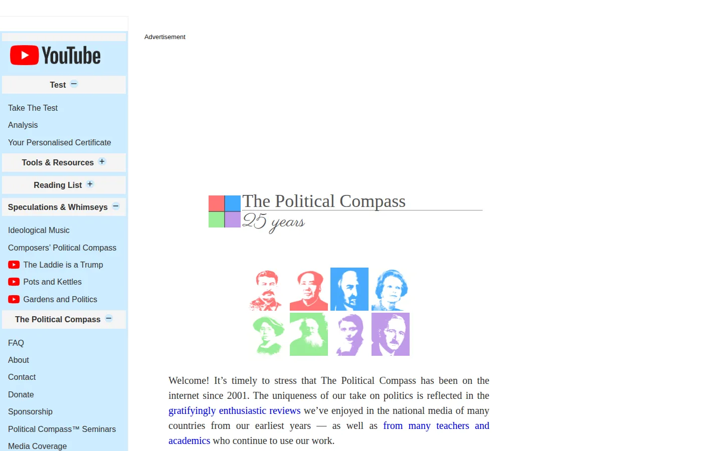
The Political Compass asks visitors to react to political propositions, then places the result across economic and social dimensions. It is best approached as a prompt for reflection and debate, not as a tiny machine that can settle a person's politics forever.
What is The Political Compass?
The Political Compass is built around a compellingly simple question: what if a political map needs more than one line? Its framework pairs an economic direction with a social one, using a questionnaire to place a result on a two-axis chart. The official FAQ is unusually frank that the prompts are propositions, sometimes intentionally broad, and that the exercise demonstrates a model rather than functioning as an ordinary survey. That makes the site more interesting when you treat it like a conversation tool. Compare a result with your own instincts, question the wording that bothers you, and notice where a neat chart makes something complicated feel tidier than it really is. Independent commentary has raised exactly that concern: political beliefs contain more texture than a couple of coordinates can hold. The compass can still be a useful starting pin, so long as nobody mistakes the pin for the whole landscape.
What you can do there
- Respond to political propositions
- View a two-axis placement
- Use results as a discussion prompt
Why we picked it
It has stayed culturally recognizable because it makes an abstract argument visual. A pair of axes can get people talking about the assumptions hidden inside familiar political labels.
How to get the most from it
Read each proposition carefully, answer in the spirit of your current view, and treat the chart as a starting point for discussion. If a prompt feels too vague or forced, note that reaction too; it may be as revealing as the final placement.
Good to know
This is a political model with unavoidable limits, not an authoritative diagnosis. The site itself acknowledges objections about wording and bias, while outside commentary questions how much ideological nuance a two-dimensional chart can capture.
Open The Political CompassMore like this
The Library of Babel

Search an imaginary library that contains every possible page of a fixed length—including this sentence somewhere.
FutureMe

Write an email to yourself and choose a date far enough away to make it meaningful.
Wowfold

A paper-plane hangar stocked with darts, gliders, and expert oddballs
Arcane Intern

A magical publishing internship where coffee runs come with sigils.