
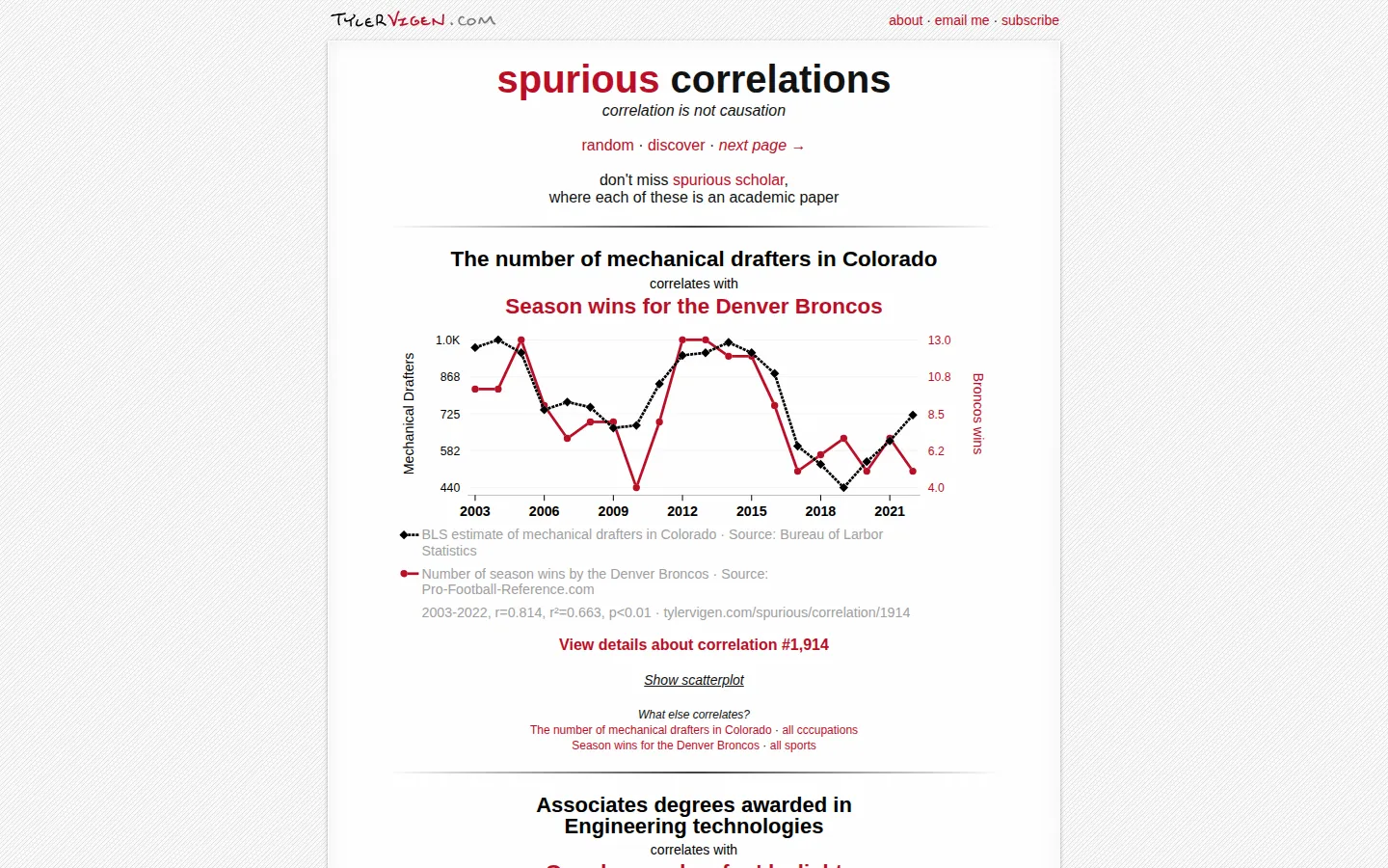
Spurious Correlations pairs real time-series data into graphs that look persuasive and mean almost nothing together. The joke lands quickly, then the page earns its keep by showing how mass comparison, clipped axes, tiny samples, trends, and confounders can manufacture a handsome statistical mirage.
What is Spurious Correlations?
Each page serves a stack of line charts whose variables have no sensible business sharing a legend. Degree counts shadow occupations, meme interest follows energy production, and names appear to keep pace with local statistics. You can jump to a random pairing, browse the catalog, follow either variable into related matches, or open a chart for scatterplots, data details, calculations, and reproducible code. The humor is deliberately obvious; the more useful trick is that the site then labels the machinery behind the illusion. Its own notes call out data dredging, yearly trends that are not independent, axes that do not begin at zero, outliers, confounders, and low sample counts. A large 2024 expansion added thousands of variables and generated side material, so the gallery now feels less like a short gag and more like a bottomless cabinet of statistical curiosities.
What you can do there
- Browse absurd paired-variable charts
- Open a chart's data and calculation details
- Find a random correlation or explore by variable
Why we picked it
The site makes a familiar warning tactile. A polished chart can trigger a story in your head before common sense catches up, and the ridiculous variable pairs expose that reflex without a lecture. Its detailed views also let curious visitors move past the punch line and inspect where the numbers and apparent certainty came from.
How to get the most from it
Start with the main gallery until one pairing makes you invent an explanation despite yourself. Then open its details, switch to the scatterplot, inspect the data links and calculation notes, and compare the full-range view when an axis has been cropped. Random is best for quick amusement; Discover is better when you want to chase one topic through several strange companions.
Good to know
Treat every pairing as a demonstration, not a causal claim. The site openly says some automatically selected variables may have a real relationship and that individual charts can contain awkward data, outliers, or small samples. Generated explanations and images are optional comic material, not evidence. No screenshot or live control test was completed, so current mobile, keyboard, motion, audio, privacy, and performance behavior remains unverified.
Who made it, and when?
Tyler Vigen is the credited creator or organization. The earliest supported launch date we found is May 2014. A documented update was recorded January 27, 2024.
Creator’s official page Open Spurious CorrelationsMore like this
The Pudding

Visual essays that use code, data, and interaction to explain culture unusually well.
Earth Nullschool

A living globe of wind, weather, ocean currents, and atmospheric motion.
The True Size Of…

Drag countries around the map and watch familiar size comparisons fall apart.
MapCrunch

Drop into a random street-level view somewhere in the world and figure out where you landed.