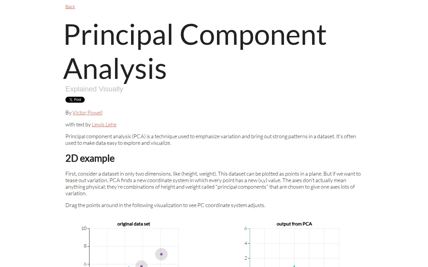
This interactive lesson turns principal component analysis from matrix fog into moving geometry. It starts with draggable 2D points, graduates to a rotatable 3D cloud, then shows what dimension reduction reveals in a 17-variable food dataset.
What is Principal Component Analysis Explained Visually?
The lesson builds PCA one dimension at a time. A simple scatterplot introduces the idea that a dataset can be viewed through a new coordinate system whose first axis captures the most variation. The next stage turns a cloud of points in three dimensions into a camera-angle problem: rotate the cloud, reveal the principal axes, and see why the least informative direction is the natural one to drop. The final section swaps toy dots for weekly consumption of 17 food types across four UK countries. Compressing that table to one and then two principal components makes Northern Ireland stand apart, giving the abstract method a memorable payoff without burying the visitor in matrix notation.
What you can do there
- Drag points to see principal axes respond
- Rotate a 3D dataset and reveal its PCA projection
- Compare reduced views of a 17-variable food dataset
Why we picked it
The page earns its intuition instead of merely declaring PCA understandable. Each section adds just one conceptual wrinkle, and the real dataset arrives only after the geometry has done the teaching. A 2020 University of Washington course deck used these same visualizations, a useful independent sign that the lesson travels well beyond its own project page.
How to get the most from it
Read the short 2D setup before moving any points, then drag one point far from the cluster and watch how the dominant direction is described. In the 3D section, compare your chosen viewing angle with Show PCA. Finish with the food table and try to predict the outlier before reading the explanation beneath the reduced plots.
Good to know
This is an intuition builder, not a full derivation or a data-analysis calculator. The source repository is public and MIT-licensed, but its setup instructions are explicitly marked outdated. Keyboard, touch, screen-reader, motion, and live-browser behavior have not yet been verified, so visitors who need a specific access method should treat support as uncertain.
Who made it, and when?
Victor Powell and Lewis Lehe is the credited creator or organization. The earliest supported launch date we found is February 12, 2015.
Creator’s official page Open Principal Component Analysis Explained VisuallyMore like this
The Pudding

Visual essays that use code, data, and interaction to explain culture unusually well.
Earth Nullschool

A living globe of wind, weather, ocean currents, and atmospheric motion.
The True Size Of…

Drag countries around the map and watch familiar size comparisons fall apart.
MapCrunch

Drop into a random street-level view somewhere in the world and figure out where you landed.