
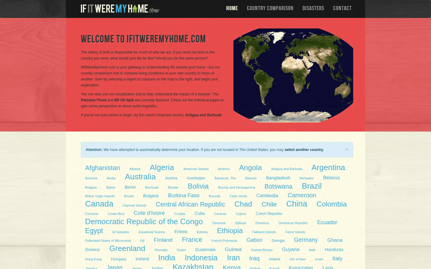
If It Were My Home turns a country comparison into a small thought experiment: pick where you call home, choose somewhere else, and use maps and broad living-condition figures to imagine the difference. It also keeps a couple of disaster-scale visualizations nearby for the same perspective-shifting trick.
What is If It Were My Home?
The premise is unusually human for a statistics site. Instead of asking you to browse a table cold, If It Were My Home starts with the country you know and asks what might change somewhere else. The homepage presents a long country list, a featured country, and a route into comparisons of living conditions. A separate pair of links points toward visualizations of the BP Oil Spill and Pakistan Flood, extending the site's habit of translating a large subject into something easier to picture. That framing has a history: the site's About page says the project began in 2010 as a way to show the BP spill's scale, then broadened after conversations with visitors. An independent TeachersFirst review describes comparison pages with maps and expandable statistics, and suggests the tool for geography or social-studies discussion. Treat the output as an invitation to ask better questions, not as a final verdict on a country. The page gives little visible detail here about the freshness or method behind each number, so a consequential decision deserves a second source.
What you can do there
- Select a home country
- Choose a country to compare
- Open disaster visualizations
Why we picked it
It makes an abstract comparison feel immediate without needing a lesson plan. The jump from country list to “what would change for me?” is a neat piece of interactive framing, and the disaster visualizations show the same instinct at a different scale.
How to get the most from it
Start with your home country, then select another country from the map or list. Read the resulting comparison as a set of prompts, follow the map and statistic sections, and open a disaster visualization if you want to see the site's scale-comparison idea in another form.
Good to know
The accessible homepage does not explain the source dates or methodology for each number, and this pass did not run a comparison page. It is best used for exploration and discussion; verify any important claim with current primary data before acting on it.
Who made it, and when?
Andy Lintner is the credited creator or organization.
Open If It Were My HomeMore like this
The Pudding

Visual essays that use code, data, and interaction to explain culture unusually well.
Earth Nullschool

A living globe of wind, weather, ocean currents, and atmospheric motion.
The True Size Of…

Drag countries around the map and watch familiar size comparisons fall apart.
MapCrunch

Drop into a random street-level view somewhere in the world and figure out where you landed.