
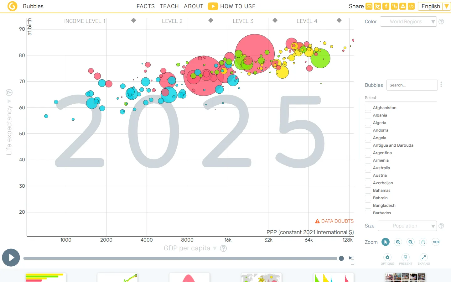
Gapminder Tools lets you poke at country-level data through bubbles, maps, rankings, tables, and moving trends. It is a fine antidote to sweeping claims that have not yet met a timeline.
What is Gapminder Tools?
Gapminder Tools begins with a deceptively simple invitation: pick some data and watch what happens across countries and years. The familiar bubbles are here, but so are maps, rankings, tables, age views, and several ways to combine geography with a chart. It is particularly good at turning a vague question into a small investigation. Change the view, compare a few places, slide through time, then notice which story survives the rearrangement. That little bit of productive fiddling is the point. The site also links to downloadable data and an offline version, so the tools are not confined to one browser tab.
What you can do there
- compare country data
- switch visualization views
- explore changes over time
- download data
Why we picked it
The charm is not just the moving bubbles. Gapminder gives the same data several costumes, which makes it easier to catch your own assumptions when a map, ranking, and time trend do not quite tell the same story.
How to get the most from it
Start with one of the named views, choose a comparison that interests you, and move through the years slowly. Switch to a map or table when a pattern looks suspiciously neat; the second view is often where the interesting question appears.
Good to know
The tools are free, and the site offers both data downloads and an offline option. Treat the visualizations as a place to investigate patterns, then inspect the source information before making a firm claim from a chart.
Open Gapminder ToolsMore like this
The Pudding

Visual essays that use code, data, and interaction to explain culture unusually well.
Earth Nullschool

A living globe of wind, weather, ocean currents, and atmospheric motion.
The True Size Of…

Drag countries around the map and watch familiar size comparisons fall apart.
MapCrunch

Drop into a random street-level view somewhere in the world and figure out where you landed.