
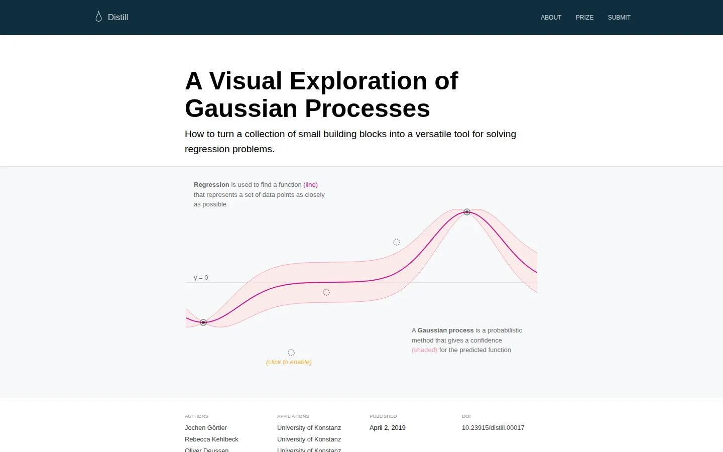
This richly illustrated Distill article turns Gaussian-process regression into a sequence of manipulable pictures. It begins with covariance and conditioning, then lets kernels, samples, training points, and uncertainty build on one another until a slippery statistical idea starts to feel geometric.
What is A Visual Exploration of Gaussian Processes?
Gaussian processes can look like a wall of matrices with a prediction hiding somewhere behind them. This article rearranges the wall into a guided sequence of diagrams. The route starts with two-dimensional Gaussian distributions, uses marginalization and conditioning to explain the machinery, and then connects points in a covariance matrix to possible function values. Later figures invite readers to tune RBF, periodic, and linear kernels, draw functions from a prior, add training observations, inspect uncertainty, and combine kernels to model a trend with a repeating wiggle. Equations remain part of the deal, but each new symbol is paired with a visual consequence. The result is less a calculator than a careful intuition workshop: change one building block, then watch what kind of function the model is willing to believe.
What you can do there
- Adjust kernel parameters in linked visual figures
- Draw samples from Gaussian-process priors
- Toggle training points and inspect uncertainty
- Combine kernels and compare fitted behavior
Why we picked it
The cleverness is in the pacing. Instead of dropping a finished regression chart on the page, the article makes covariance, kernel choice, observed data, and uncertainty arrive one at a time. That structure gives an abstract method a set of handles, and an independent Carnegie Mellon course has used the piece as Gaussian-process reading.
How to get the most from it
Give this one a proper sitting rather than skimming for the final chart. Pause at each figure, make one change at a time, and predict what the covariance matrix or sampled function should do before moving the control. The kernel-combination section is the payoff, so keep the distinction between linear, periodic, and RBF behavior in view.
Good to know
This is a long, equation-heavy technical read, not a lightweight data toy. Its figures are described as using dragging, clicking, hovering, sliders, and checkboxes; keyboard, touch, and screen-reader support are not documented. The article links its source, reviews, references, and reuse terms, while individual reused figures may carry separate rights notes.
Who made it, and when?
Jochen Görtler, Rebecca Kehlbeck, and Oliver Deussen is the credited creator or organization. The earliest supported launch date we found is April 2, 2019.
Creator’s official page Open A Visual Exploration of Gaussian ProcessesMore like this
The Pudding

Visual essays that use code, data, and interaction to explain culture unusually well.
Earth Nullschool

A living globe of wind, weather, ocean currents, and atmospheric motion.
The True Size Of…

Drag countries around the map and watch familiar size comparisons fall apart.
MapCrunch

Drop into a random street-level view somewhere in the world and figure out where you landed.