
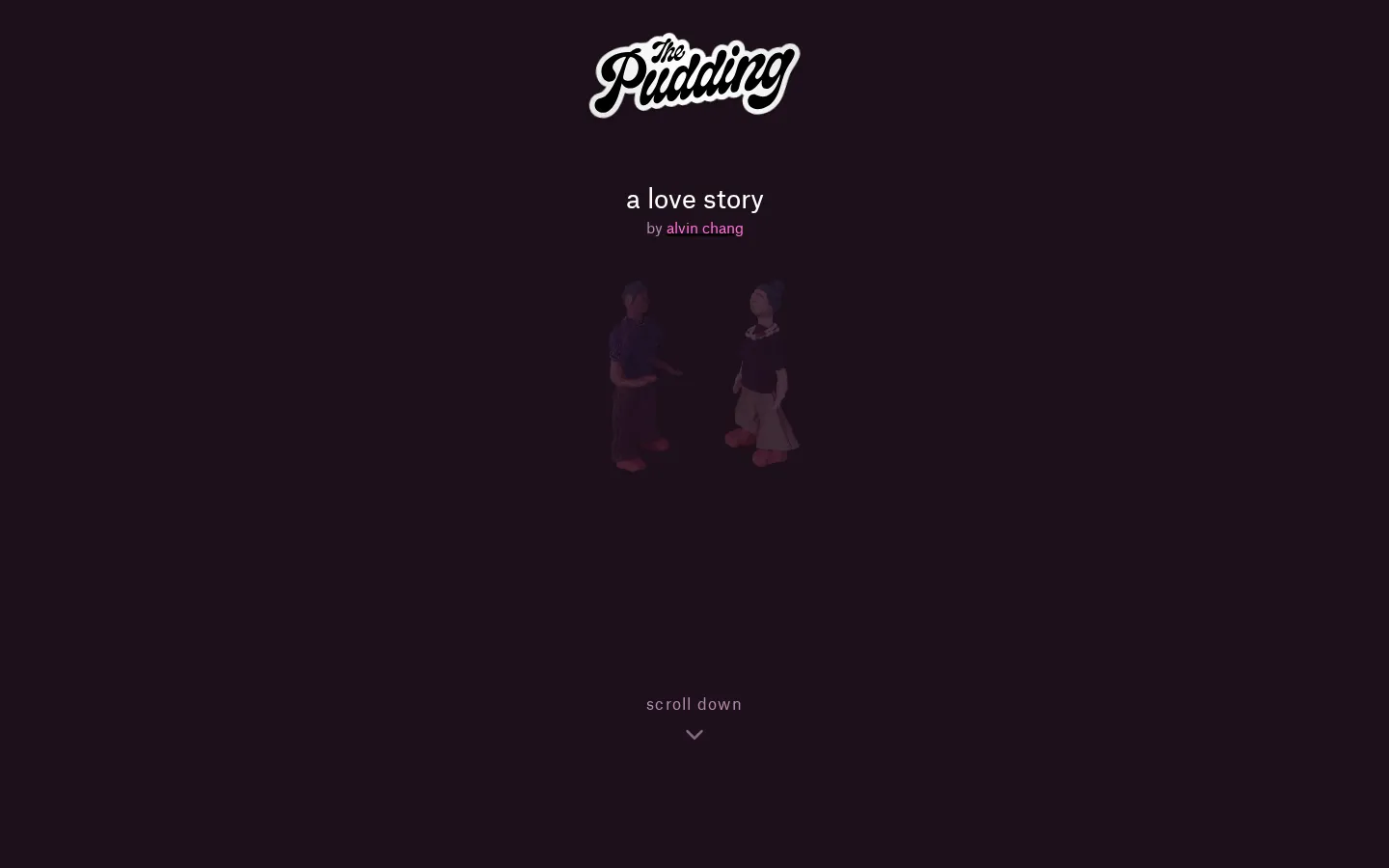
A Love Story turns a three-wave Stanford relationship survey into a patient, person-by-person account of what changed before, during, and after pandemic lockdowns. The tiny figures make the cohort feel human; the methodology note keeps those figures from masquerading as population percentages.
What is A Love Story?
The essay starts with one long marriage and then pulls the camera back to a field of survey participants. As the years advance from 2017 to 2020 and 2022, relationship ratings, breakups, arguments, safety agreements, and ways of meeting become parts of the same social weather map. The clever move is not merely animating a dataset. It lets individual stories carry the emotional weight while weighted charts do the statistical work. Historical detours broaden the question from who stayed together to what modern partners are expected to provide for one another. By the time the data explorer arrives, the piece has made its rows feel less like records and more like lives caught in a three-date snapshot.
What you can do there
- Follow relationship outcomes across three survey waves
- Select person icons for individual details
- Inspect weighted charts and the data explorer
Why we picked it
It finds a rare balance between intimacy and methodological honesty. A selectable person is more memorable than another bar, yet the page plainly says its icon field is unweighted and reserves representative estimates for the charts. That small disclosure is the hinge that keeps an affecting visual device from becoming a misleading one.
How to get the most from it
Read the opening couple's thread before scanning the crowd, then select a few people rather than trying to absorb every icon at once. Pause at the methodology section before treating any visual proportion as a population estimate, and use the final explorer when you want to compare patterns rather than follow the essay's argument.
Good to know
This is a reflective data essay, not relationship counseling. It deals with conflict, separation, divorce, pandemic stress, and personal testimony. The main icon field includes only people present in all three survey waves and is not itself weighted; the individual charts use representative weights. Live controls, motion, audio, and assistive-technology behavior were not tested, and no screenshot was captured in the approved isolated environment.
Who made it, and when?
Alvin Chang is the credited creator or organization. The earliest supported launch date we found is June 2026.
Creator’s official page Open A Love StoryMore like this
The Pudding

Visual essays that use code, data, and interaction to explain culture unusually well.
Earth Nullschool

A living globe of wind, weather, ocean currents, and atmospheric motion.
The True Size Of…

Drag countries around the map and watch familiar size comparisons fall apart.
MapCrunch

Drop into a random street-level view somewhere in the world and figure out where you landed.